Design For Others: Movie Fanatics

Intro
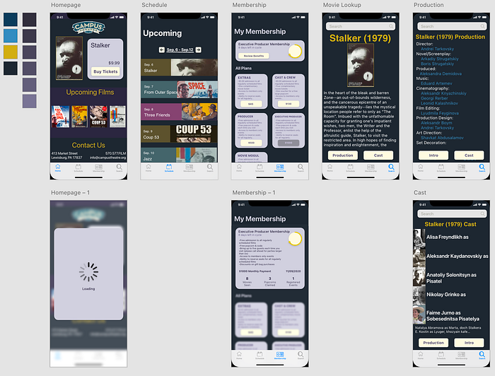
For our first major project in Human Computer Interface, we chose to take on the Campus Theatre website, here near Bucknell University’s Campus. We took an iterative process of designing the website in a way to cater towards our designated group: ‘Film Nerds’. First, we initially dug deep into the internet to find sources and first-hand evidence of our designated group’s needs. Then we sketched out our general designs on paper to generate quick ideas. With these ideas, it gave us adequate inspiration to pick out a moodboard. After these three, it allowed us to prototype in Adobe XD our first version. Once we presented this version in class, feedback was given to us, which aided us in revising out final prototype shown above.
Needsfinding

When designing anything, the most important step that is overlooked is research. Due to the nature of design, not everyone can have representation in the team itself; this means that we need to look into concrete evidence from who we are designing for. Our holistic view was to do evidence-driven research for each of our motivations in design. Since our group is movie fanatics, we chose to look into the site that movie lovers use often and sites that they discuss on (e.g. forums and Reddit). We noticed that the trend that movie fanatics have different goals when viewing a movie, they do research before and after the viewing. They also have the incentive to utilize membership opportunities to the max, due to the nature of the higher movie count per month.
Sketches
Our sketching process started with the idea that the core emphasis of each panel should revolve around our previously researched theses. We concluded that we should have our four panels as such: Homepage, Schedule, Membership, and Movie Search.


The sketches above show our initial vision of the setup of the app. First of all, we opted to go with the tabbed approach for mobile; this convention easily allows for different pages with direct purposes to be reached without being hidden.
The homepage consists of aggregated information and anything that needs to be highlighted for the user. We even considered to show an algorithmic approach, so the homepage can use past use to predict patterns of movie fanatics’ common uses.
The schedule page is designed to be the place for moviegoers to plan their calendars with the upcoming movies. It is evident that movie fanatics watch and research a lot of movies, so this page allows them to overview the supply of movies and pick and choose. We also thought about tapping them to preorder tickets or even bring them to the advanced search system for more information.
The membership page is there to allow movie fanatics to overview their membership and payment for each respective tier. We chose to do this because membership is an important factor to the campus theatre website, and movie fanatics who watch a lot of movies can benefit the most from membership bonuses.
The last page is the advanced film search feature. This page is a general page of information for each film that can be searched. Film Fanatics need more information than the general public when going in and coming out of a theatre, and thus we sketched out this page to maximize information. This is inspired by IMDb and other information aggregate sites, all localized in our redesign.
Moodboard


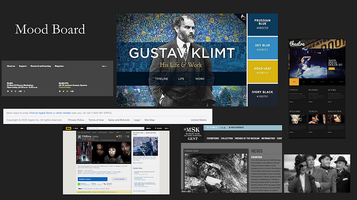
For our moodboard, after the research process, we decided to continue the aesthetic of the current website. This was motivated due to the fact that a drastic color change can be a deterrent to avid users of the website, and also research indicated that most websites that related to movies had a dark theme. This night time vibe that is associated with films made it the perfect choice to stay how it is. We also have a few primary colors used for the foreground elements to make everything pop, these include a dark, a gold, and two shades of blue. These were generated from coolors, which pairs a color scheme with related colors using AI and color science.
Prototypes

Our Adobe XD prototypes consist of the culmination of all of the previous work shown; we took the good that benefits movie-goers and removed the bad from the messy campus theatre webpage. The campus theatre webpage has some of the elements that the mobile prototypes has, but we didn't think every feature was as useful to movie fanatics.
First Prototype Draft

This is our first iteration that we presented to our class. We shared our Adobe XD project with our peers and allowed them to interact with it while they gave some critique. Along with the peer review, our professor gave some visual tips to clean up our design; he stated that besides the visual clutter, most of the project worked out well :). The issues were: font irregularity, button ambiguity, unconventional search bar signifiers, and busy backgrounds. Once these visual issues are fixed, most of the goals of the project are achieved.
Final Prototype

In the final prototype, with the feedback from our peers and professor, we updated some of the visual clutter. The main changes include the updating of buttons, which were initially ambiguous looking. The font was standardized since the first draft had an artistic font that was too difficult to decipher. A new page was appended to the homepage to interact with when they buy ticket button is pressed. The background colors were also standardized to make sure every page has the same amount of pop for frontload UI elements.
Conclusion
Our prototype was not perfect. Our peers and professor provided helpful feedback, pointing out areas where our original design had not accomplished its purpose. For example, there was a lack of consistency across our screens, both for fonts and button visuals, that made the design disjointed. If we were to continue to refine this prototype, ensuring that consistency would be important to make the user experience feel cohesive.
Nonetheless, we are extremely proud of what we have created. Designing from the perspective of someone who you cannot talk to is extremely difficult but also vitally important. By focusing on one particular user group, we learned the value of user-centered design. Design is a process, learned by doing. Our first experience is now behind us, and we will be sure to remember what worked — and what didn’t — when we next go through the design process.
