Stephen Curry Popcorn Rating Visualization Critique
This data visualization post on /r/dataisbeautiful by user canonicalized (Dorian Banutoiu) maps the scores that Steph Curry gave to each arena’s popcorn for every away game he played over the 2019 season. It uses Tableau to create an interactive line chart ranging from one to five for each of the categories used to rank: Freshness, Saltiness, Crunchiness, Butter, and Presentation. The concept of visualizing this data is extremely interesting due to its novelty and diverse approaches available. I will be taking a look and critiquing the general approach to data visualization shown, in both a positive and negative light.
Data

Raw Data
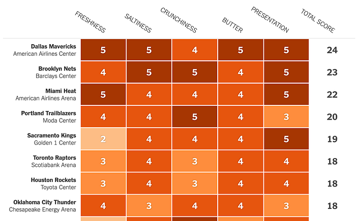
The Data that is used in the visualization is from the rankings posted by Steph Curry on his social media with his custom made rubric shown below. The New York Times wrote an article on this topic with their own data visualization in the form of a table using a sequential luminance color arrangement.

Data Exclusion
The visualization doesn't explicitly leave out any groups, but due to the visualization relying on interaction, some of the arenas are grouped together without allowing one to see which ones they are. This is due to the nature of the subreddit only allowing images, not interactive data visualizations. Moreover, when the visualization is glanced at, there is no distribution that can be derived from it. Other misleading details could include the fact that one of the arenas (Oracle) is highlighted, this draws extra attention to it; it makes the audience question if there is any significance to it.
Should this visualization ever been made?
This question is very interesting as it is extremely trivial and was definitely made for fun, even the original data itself was a humorous project to Steph Curry himself. Therefore, the question lies, is there a point to visualize data even if it doesn't serve a deeper social/political critique. I think it is beneficial to see the rankings in an additive way, since if we only look at Steph’s images, they are discrete rubrics. Imagine having 29 individual pieces of paper, how do we see a clear ranking from this. The data definitely should have been visualized from the data that has already existed.
Predispositions
Motivation
The drive to create this kind of visualization feels completely novel, there are no implicit motivations that the creator had besides just seeing the ranking. It feels too far fetched to say that this visualization had ill-intentions and wished to promote one form of interpretation. This stems from the simplicity of the initial data itself; there are very few ways to view a cumulative score in a different light. To bring up an alarming issue is that they chose to average the total number, while Curry’s data only has the total score. It is important to understand that the total score and average score tell different stories. The five factors should be seen in parallel and not as an aggregate, as the mean will obscure the data points. This subtle distinction can be easily modified if plotted with total score rather than the average. The average that is taken hides all of the five intricate facets that Steph Curry analysed while having the popcorn.
Audience
The direct audience this visualization is catered towards is the dataisbeautiful subreddit. A quick look shows that the post did not go viral and received no comments, which can indicate that the visualization was good enough for the standards of the Reddit audience. The implicit audience that surfs the subreddit that the post is directed towards include, data nerds, basketball fans, and people looking for humor/novelty. In a way, this serves as a general audience (i.e. everyone), and doesn't leave out many marginalized groups. With all of the evidence that is observed, one can easily discern the data from the visualization, even without the prerequisite knowledge of the arena, basketball, or popcorn in general. A point to note also shows that if we don't see the names of all the arenas due to them sharing mean score values, it prevents the audience from seeing the team they support, which promotes personability.
Visual Representation
The visual component of this diagram is the most egregious part of the post, and this failure of communicating the meaning of the data resulted in the post only receiving 14 upvotes with 78% positivity. First of all, the jagged lines all across the screen are extremely messy on the initial viewing. The Data-to-Ink ratio is actually well preserved here, but then again the overlapping nature of it causes it to break down.
The color scheme is very neutral and appealing to a minimalistic frame of design, it holds everything in a dim color until highlighted, if using the interactive version. The spacing in the visualization is the weakest link, design wise. The points on the right side make it difficult to see which Team’s popcorn is being highlighted, while also making the trends imperceivable.
Redesign

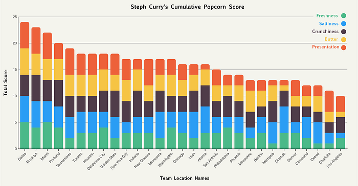
This redesign aims at tackling some of the issues stated above.
- By opting into using a stacked bar chart, it allows us to not only see the total score of each arena, but how each factor contributed.
- The spacing here allows for all of the teams to be listed at once and makes a trend of ranks easy to discern.
- The color scheme is more popping and attention grabbing; it uses the unordered hues schematic. Some of the colors even match with our implicit perception of the factors e.g. butter being yellow.
- A clean and colorful graphic like this allows for a quick look to get as much information at once.
